Code
if (!require("pacman")) install.packages("pacman")Loading required package: pacmanCode
pacman::p_load(haven, DescTools, knitr, kableExtra, ineq, ggplot2, formatdown, tidyverse, WDI, latex2exp)Lecture 5: Module 2-Population
if (!require("pacman")) install.packages("pacman")Loading required package: pacmanpacman::p_load(haven, DescTools, knitr, kableExtra, ineq, ggplot2, formatdown, tidyverse, WDI, latex2exp)Population growth: a problem or not?
Go back in time assuming world population was 2% less each year.
The calculation gives you a world population of 250 000 people 500 years ago and …
10 people 1000 years ago.
So, for the longest part of it history, human population was not growing: population growth rate itself has increased over time, being reversed only recently.
How does population affect development?
How to value lives of the unborn? Which is better: less better off people or more people in moderate circumstances? We avoid this question by looking at per capita welfare
Size of population also matters from a functional viewpoint
Available resources may be affected positively by the population
Necessity = the mother of invention
Doomsday scenarios: depletion of resources, lesser welfare.
How does development affect population?
Is there a relationship between what the developed countries have experienced demographically and what the developing countries are facing now?
How does economic development affect fertility choices?
Are couples having more children than what would be good or rational for them? Do they internalize the social impact of their decisions?
Is it true that population growth is always harmful to economic development?
Birth rate: Births as numbers per 1000 of the population
Death rate: Deaths as numbers per 1000 of the population
Population growth rate: Birth rate \(–\) death rate in percentages
Age specific fertility rate: Average number of children per year born to women in particular age group
Total fertility rate: Adding up all the age-specific fertility rates over the age groups. Total number of children a woman is expected to have over her life time.
Low income countries: birth and death rates are high (Mali, Malawi)
Middle income countries: death rates fall but birth rates are still high (Kenya, Pakistan)
Richer countries: also birth rates fall. (Thailand, Korea)
This happens for a single country over its history as well
# Define the countries of interest
countries <- c("MLI", "MWI", "SLE", "GNB", "KEN", "NGA", "GHA", "PAK", "IND", "BGD", "CHN", "NIC", "COL")

# Define the indicators of interest
indicators <- c(PerCapitaGDP = "NY.GDP.PCAP.CD",
                BirthRate = "SP.DYN.CBRT.IN",
                DeathRate = "SP.DYN.CDRT.IN",
                PopGrowthRate = "SP.POP.GROW",
                IncomeGroup  = "income")

# Fetch the data for the most recent year available
wdi_data <- WDI(country = countries, indicator = indicators, extra = TRUE, start = 2015, end=2015)

data_pop1 <- wdi_data |>
  select(country, PerCapitaGDP, BirthRate, DeathRate, PopGrowthRate, IncomeGroup)

knitr::kable(data_pop1,
             format ="html",
             col.names = c("Country", "GDP per capita", "Birth rate", "Death rate", "Pop. growth (%)", "Income Group" ),
             ) |>
footnote(c("Source: The World Bank, World Development Indicators"))| Country | GDP per capita | Birth rate | Death rate | Pop. growth (%) | Income Group |
|---|---|---|---|---|---|
| Bangladesh | 1236.0 | 19.16 | 5.776 | 1.1911 | Lower middle income |
| China | 8016.4 | 11.99 | 7.070 | 0.5815 | Upper middle income |
| Colombia | 6228.7 | 15.59 | 5.168 | 0.9420 | Upper middle income |
| Ghana | 1711.3 | 31.71 | 7.773 | 2.3643 | Lower middle income |
| Guinea-Bissau | 586.0 | 35.52 | 9.223 | 2.5826 | Low income |
| India | 1590.2 | 18.77 | 6.670 | 1.1878 | Lower middle income |
| Kenya | 1496.7 | 30.96 | 7.361 | 2.2003 | Lower middle income |
| Malawi | 544.3 | 35.77 | 8.005 | 2.7591 | Low income |
| Mali | 723.5 | 44.34 | 10.211 | 3.1467 | Low income |
| Nicaragua | 2025.3 | 22.80 | 4.635 | 1.4379 | Lower middle income |
| Nigeria | 2679.6 | 39.51 | 13.803 | 2.5412 | Lower middle income |
| Pakistan | 1421.8 | 29.70 | 7.097 | 1.2966 | Lower middle income |
| Sierra Leone | 581.3 | 34.56 | 10.712 | 2.4087 | Low income |
| Note: | |||||
| Source: The World Bank, World Development Indicators |
1804: 1 billion
1927: 2 billion
1960: 3 billion
1974: 4 billion
1987:5 billion
1999: 6 billion
2011: 7 billion
2022: 8 billion
Carrying capacity of Earth increased with agriculture and population started to grow, minimally.
Malthus (1798):
“God” ‘s checks and balances to the sexual energies of women and men’: High birth rates led sooner or later to higher death rates (plague, pestilence and famine).
High income \(\rightarrow\) more children \(\rightarrow\) less income per person (land fixed).
Increased land or technology would not change this as population will grow enough to take the economy back to the subsistence level again.
Sanitation methods, increased productivity of agriculture and industry led to reduced death rate
Birth rate stayed high because of the loosening of Malthusian restraints and the inertia
Birth rates fell over time
This process of transitioning from high birth and death rates to low birth and death rates is called the demographic transition.
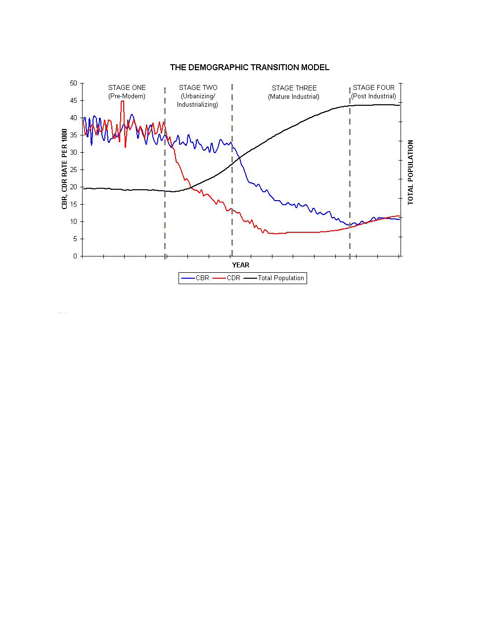
Population growth rate increases because birth rates do not instantly adjust to changes in death rates.
Two forms of inertia that keep birth rates from adjusting instantly:
Macro-inertia: inertia that takes place at the level of the overall population.
Micro-inertia: inertia that takes place at the level of the family.
Macro-inertia (discussed in class already): large amount of young people \(\Rightarrow\) total births stay large even when fertility rates come down.
Missing markets.
Externalities.
Opportunity cost.
Developing countries tend to lack social support systems such as social security or pensions for older individuals \(\Rightarrow\) people rely on their children to support them.
If infant mortality is high then people need to have a lot of children so that one or two will survive into adulthood, make money and support them.
Other considerations: the child may not earn a good income (more likely in poorer country) or the child may choose not to look after her parents.
Lets examine how these factors play into decisions on how many children to have:
Example
Let \(p\) be probability a child looks after her parents.
Let \(q\) be probability a parent finds acceptable of receiving support from at least one child.
Parents want to choose \(n\) such that \(1-\left( 1-p\right)^{n}>q\)
How does this affect household fertility decisions?
Parents want to choose \(n\) such that \(1-\left(1-p\right) ^{n}>q\)
Now lets look at some numerical examples.
South Africa: infant mortality \(0.061\), AIDS rate \(21\%\), unemployment rate \(30\%\).
Let \(p=(1-0.061)(1-.21)(1-.3)\cong0.52\).
If \(q=95\%\) then \(\Rightarrow\) \(n>5\)
Nigeria: infant mortality \(0.097\), AIDS rate \(5.5\%\), poverty rate \(60\%\).
Let \(p=\left( 1-0.097\right) \left( 1-.055\right) \left(1-0.60\right) \cong0.34\).
If \(q=95\%\) then \(\Rightarrow\) \(n>8\)
From these two examples one can see how having 95% security that one will be taken care of in her old age requires large families.
This shows how a lack of state support or welfare programs can lead to families demanding large amounts of children.
Having state support or welfare program can also lead to a large demand for children!
\(\Rightarrow\) Total social cost of raising children not carried by parents alone
\(\Rightarrow\) Private costs of children smaller than social costs
This generate some externalities: a third party (e.g. tax payers) pays part of the cost of the household private decisions on the number of children.
In Figure 1, the social costs exceeds the private costs. As the result, the social optimal number of children per couple \(n^{\star}\) is smaller than the private optimum \(n^{\star \star}\)
import matplotlib.pyplot as plt
import numpy as np

# Generate a range of values for the number of children
children = np.linspace(0, 10, 100)

# Define the benefits, social costs, and private costs functions
# Setting intercepts to zero for the social and private cost curves
benefits = np.log1p(children) * 12    # Logarithmic benefit curve
social_costs = 3 * children           # Linear social cost curve starting from zero
private_costs = 1.8 * children        # Linear private cost curve starting from zero

# Create the plot
plt.figure(figsize=(10, 8))

# Plot the benefits, social costs, and private costs
plt.plot(children, benefits, label='Benefits')
plt.plot(children, social_costs, label='Social Costs', linestyle='--')
plt.plot(children, private_costs, label='Private Costs', linestyle='-.')

# Add the vertical lines for n* and n**
plt.axvline(x=3, color='grey', linestyle='--', lw=1)  # Arbitrary value for n*
plt.axvline(x=7, color='grey', linestyle='--', lw=1)  # Arbitrary value for n**

# Annotate the n* and n** lines
plt.text(3, plt.ylim()[0] - 1, 'n*', horizontalalignment='center')
plt.text(7, plt.ylim()[0] - 1, 'n**', horizontalalignment='center')

# Label the axes
plt.xlabel('Number of Children')
plt.ylabel('Costs and Benefits')

# Add a legend
plt.legend()

# Add grid
plt.grid(True)

# Show the plot
plt.show()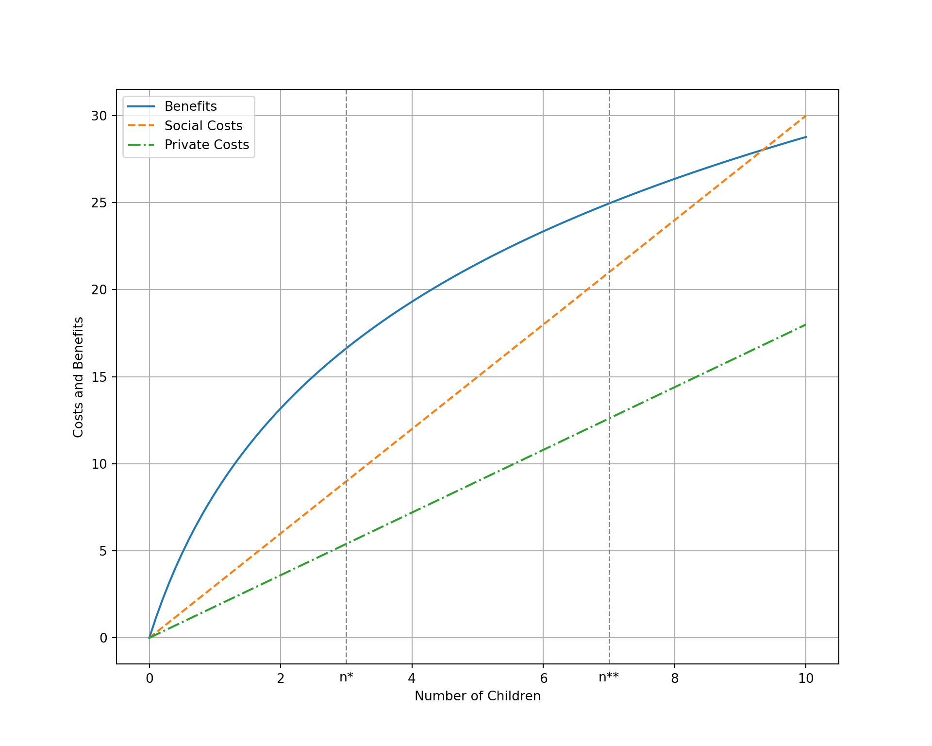
Two types of costs of having children:
Direct Costs
Indirect or Opportunity Costs
Countries with low opportunity costs \(\Rightarrow\) fertility tends to be high.
Case 1: Person A raises the children and Person B brings home money. Let income of person B \(\Uparrow\) \(\Rightarrow\) Demand for children goes up.
This is illustrated in Figure 2
Scale for y is already present.
Adding another scale for y, which will replace the existing scale.# Define prices and income
Px <- 10
Py <- 8
I <- 400
xmax <- I/Px
ymax <- I/Py
# Define range of x values
x <- seq(0, xmax, by = 1)
# get y based on prices, income and x
y <- budget(x, Px, Py, I)
# solve find the optimal bundle
opt <- find_opt_ces(Px, Py, I)
x_star1 <- opt[[1]]
y_star1 <- opt[[2]]
ubar1 <- opt[[3]]
#df.ic <- indif(x, )
# # Calculate corresponding y values for budget constraint and indifference curve
y.bc <- y
y.ic <- indif_ces(x, ubar1)
#
# # Create data frames for budget constraint and indifference curve
df2.bc <- data.frame(x = x, y = y.bc)
df2.ic <- data.frame(x = x, y = y.ic)
# Plot budget constraint and indifference curve
p2 <- fig1 +
geom_line(data = df2.bc, aes(x, y), color = "blue", linewidth = 1) +
geom_line(data = df2.ic, aes(x, y), color = "blue", linewidth = 1) +
xlab(label=TeX("$Children \\Rightarrow$")) +
annotate("text", x=x_star1-3, y=y_star1-3, label="E1", size=5, color="red")
fig2 <- p2 + geom_segment(aes(x = x_star1, y = 0, xend = x_star1, yend = y_star1),
linetype = "dashed") +
geom_segment(aes(x = 0, y = y_star1, xend = x_star1, yend = y_star1), linetype = "dashed")
fig2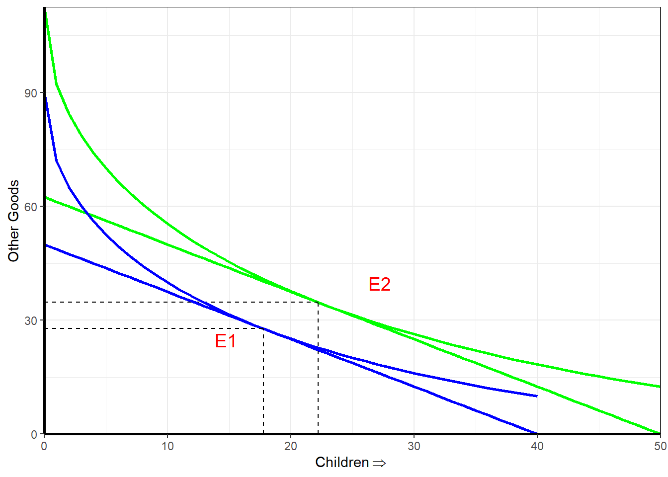
Case 2: Person A raises the children and gets offered a high paying job while Person B brings home the same amount of money \(\Rightarrow\) Demand for children \(\Downarrow\) because opportunity costs for Person A \(\Uparrow\)
This is illustrated in Figure 3
Scale for y is already present.
Adding another scale for y, which will replace the existing scale.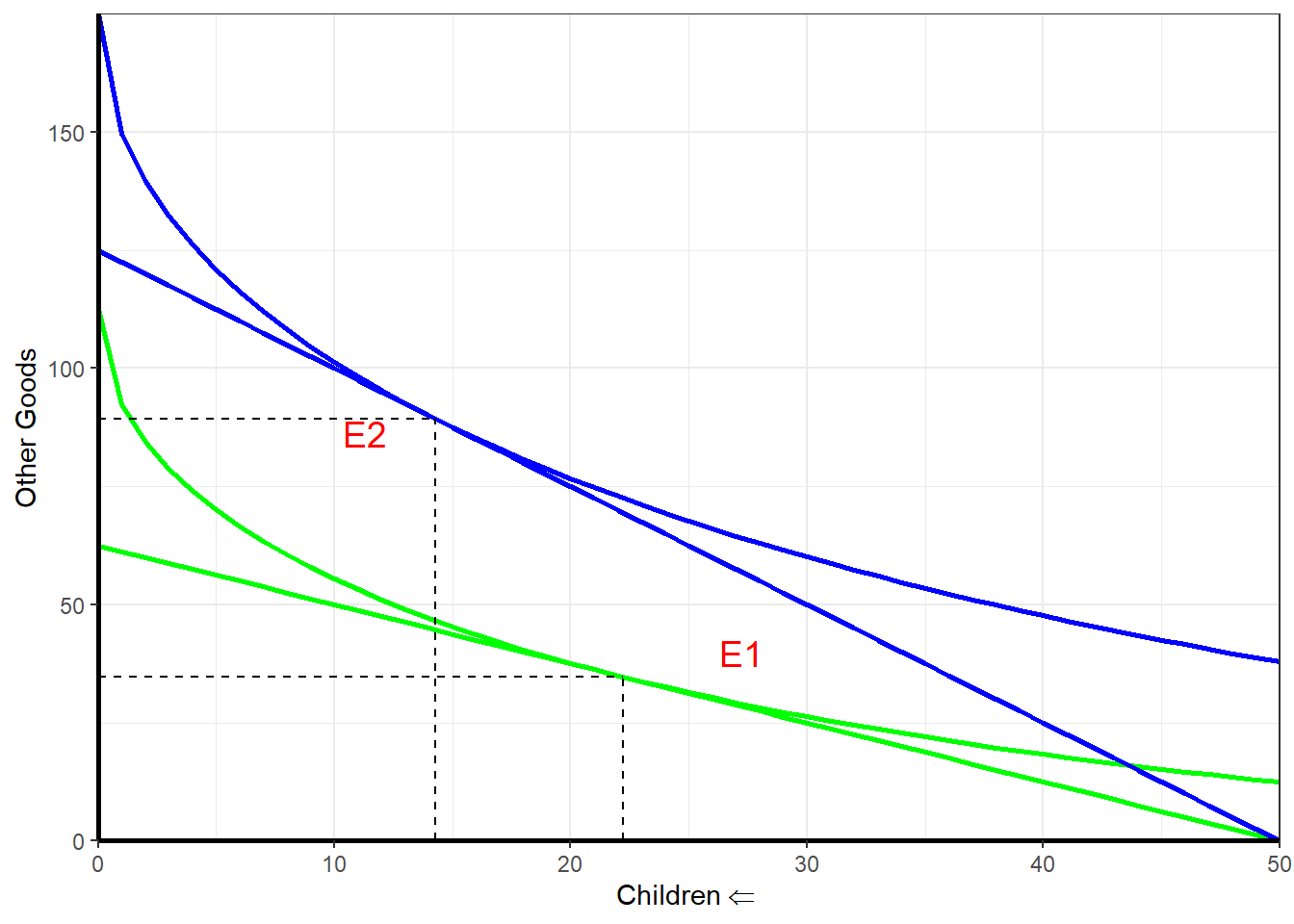
Demand for children \[ C_{d}=f\left(Y, P_{c}, P_{x}, t_{x}\right), x=1,...,n \]
where
Interpretation
The higher the household income, the greater the demand for children
\[ \frac{\partial C_{d}}{\partial Y}>0 \]
\[ \frac{\partial C_{d}}{\partial P_{c}}<0 \]
\[ \frac{\partial C_{d}}{\partial P_{x}}>0 \]
\[ \frac{\partial C_{d}}{\partial t_{x}}<0 \] - Causes of, and Policy Responses to, High Fertility in Developing Countries: Lessons from Microeconomic Household Models
The above list provides a framework for policy
Some policy approaches